Cabinet
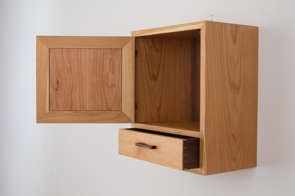
This wall hung cabinet was my second design project at VWS. My initial design for this semester was a very ambitious piece with mutlitple curves. Half way through the project I took account of what was left to be done, how many hours it would take, and I realized I didn’t like the design enough to see it through. I knew I would learn more from a simple project well executed than a shoddily constructed piece with every crazy technical woodworking feature I could fit in.
Too much fun with CAD
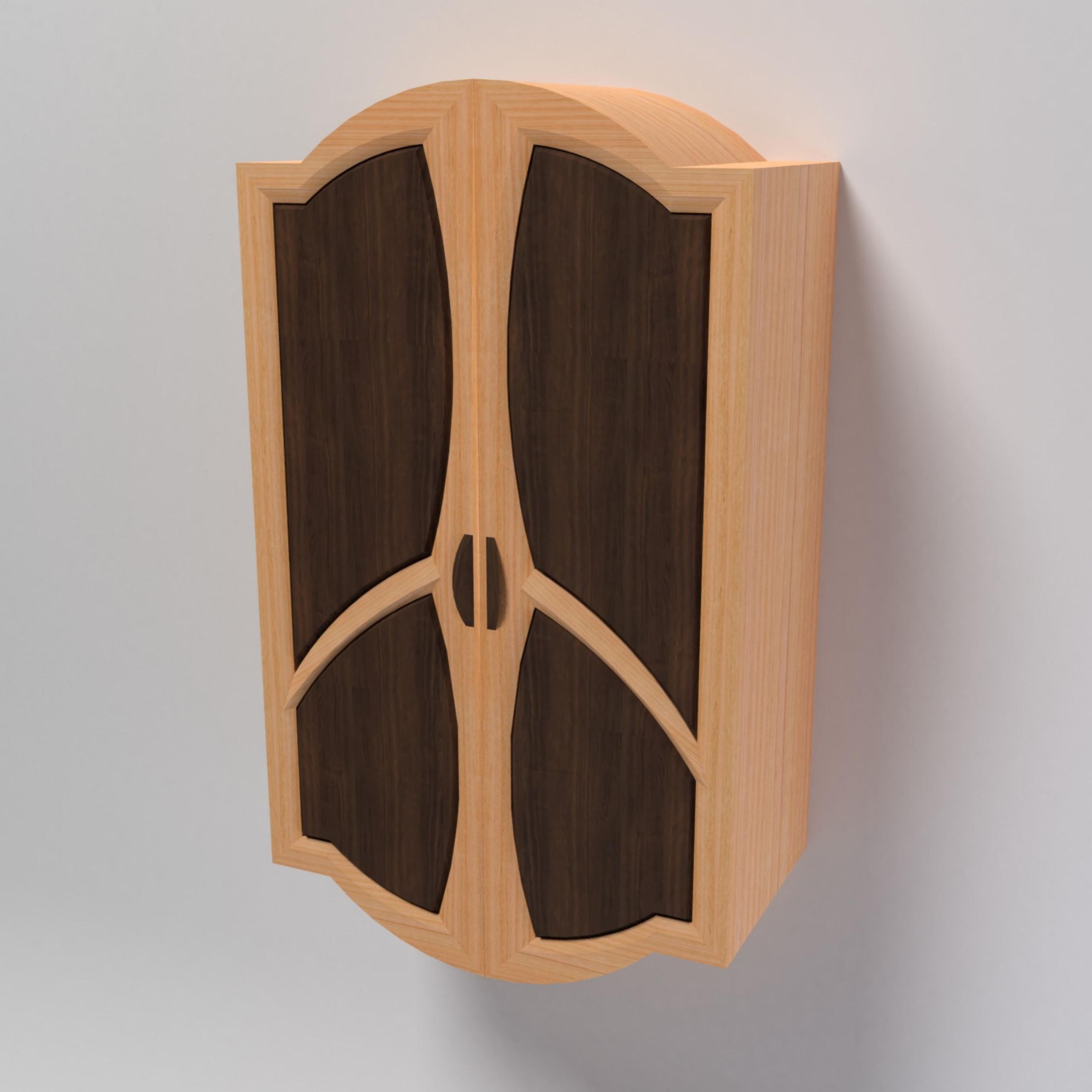

My first design really sucks. It’s a little embarrasing to post but it goes to show how more is not always better. Notice the two symetrical bent laminations on the top and the bottom. Also notice how the drawers are each bent lams riding inside of another bent lam. Obviously you could cheat this by creating a square drawer box and some runners and just have an applied face that matches the curve below - but that would be lame. When I do get around to making curved drawers they will be legit.
This was the result of me having too much fun in SolidWorks. I enjoyed putting it together on the computer. I enjoyed rendering in it Blender. I did not enjoy making it out of wood. Its’ mechanical design shows through in an incoherent aesthetic. Every step of the way was littered with problems (of the most obnoxious temperament) stemming from the fact that it was designed in direct defiance of the medium.
Going old school
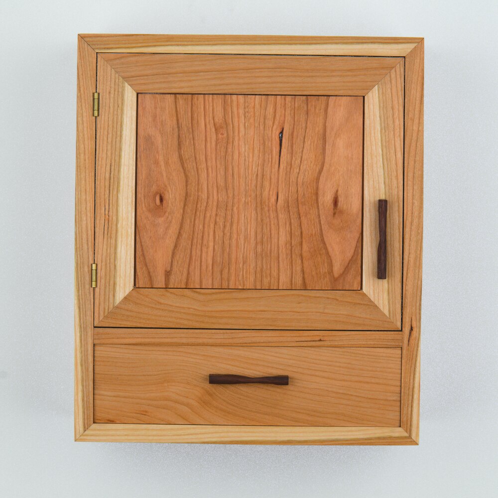
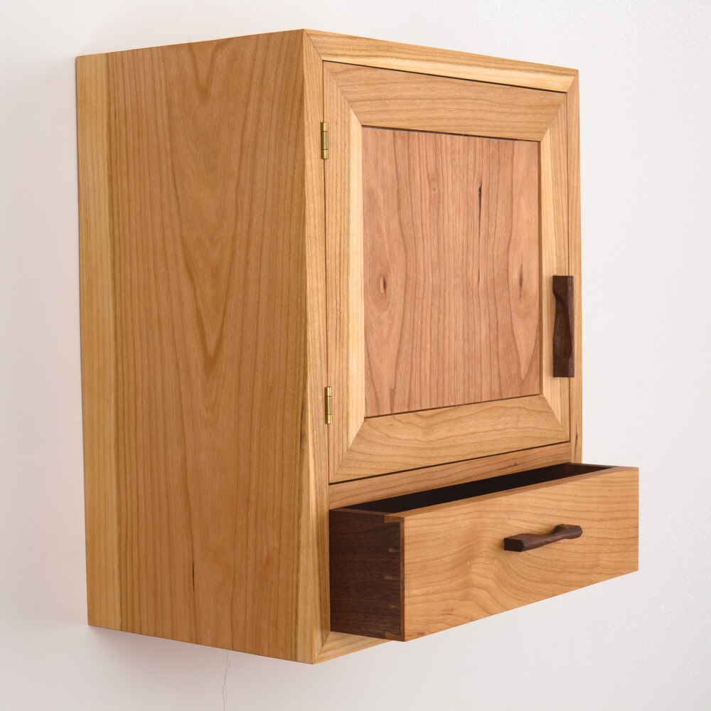
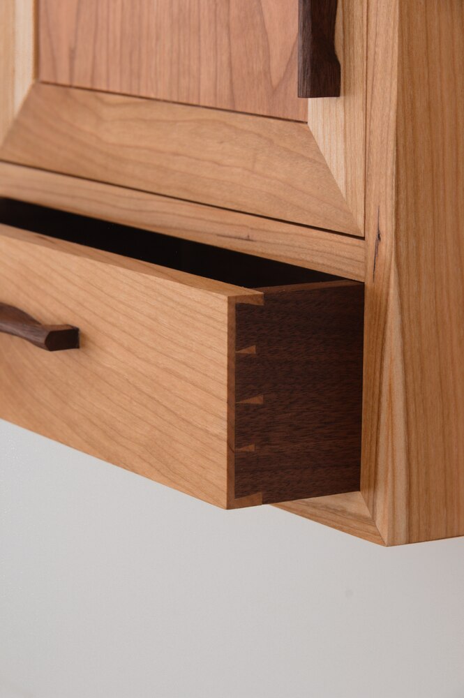
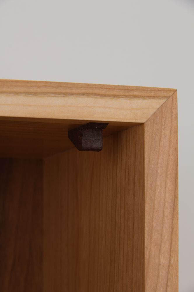
For round two I went back to pen and paper. The design I came up with is quite plain. It’s just a rectangle with a drawer. What it has that the original design lacks is proprotion and unity. Only in simplicity of form can details shine. The pulls as well as the door stop are hand carved from walnut. It has one drawer with single-entry houndstooth dovetails. The case is finished with danish oil and the interior with shellac. (My shellac finish was admittedly not great which I resolved to make up for in my next project)

